Nurturing a preschool’s growth.
Primavera School —
Brand Identity
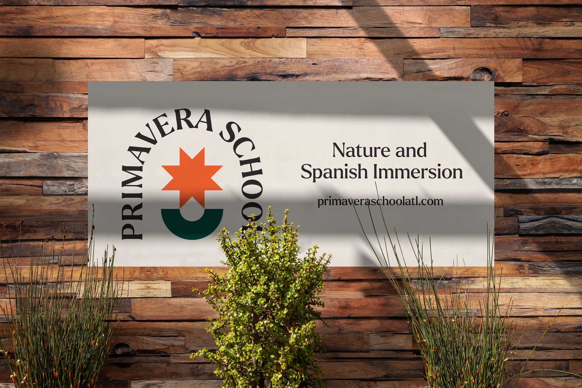
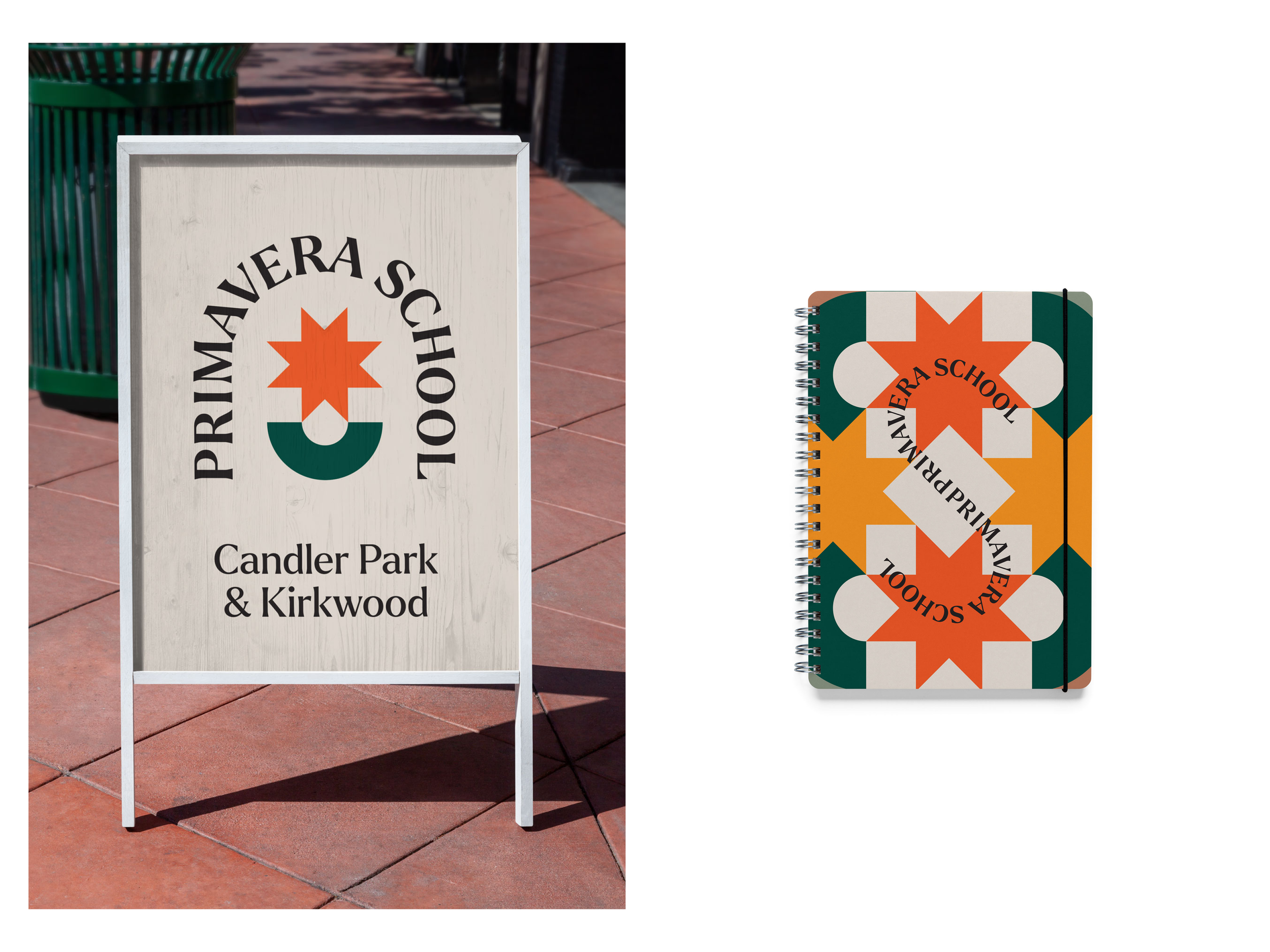


Primavera is a nature and Spanish immersion school located in the neighborhoods of Candler Park and Kirkwood, Atlanta. Offering a preschool and kindergarten, the curriculum promotes play and love of nature, social-emotional development, speaking Spanish, and learning about different cultures from around the world.
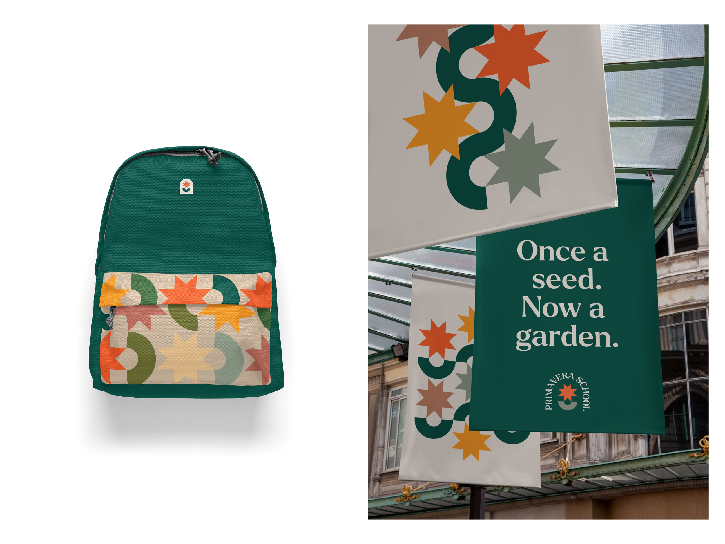
Started as a neighborhood play group in 2010, Primavera now has two established campuses for toddler and multi-age classes. As Primavera continues to grow and evolve, it remains a highly communal, grassroots school at its core. The ask was to refine the brand into a more mature space while honoring its ethos of play-based learning and community.
The new mark combines the school’s love of nature and multicultural spirit into a singular icon. A flowering plant or shining sun, the logo can be interpreted in different ways and creates a foundation for playful expression.
Role
Creative Direction & Design

Mood board for Primavera brand identity. The school director wanted a clear and simple logo using colors grounded in nature. We chose an earth tone palette with pops of orange and red. This gives the brand flexibility —the colors can be arranged to instill a sense of calm or be bright and playful.