Evoking nature’s
untamable spirit.
Wyld —
Brand Identity
Packaging
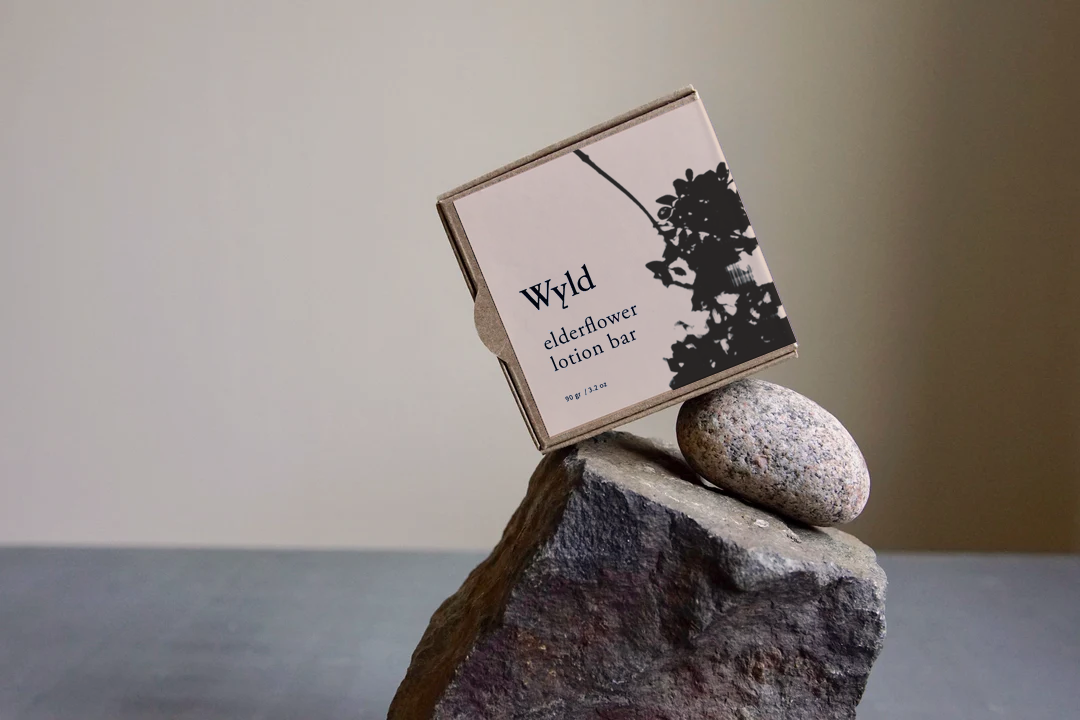


Wyld is a collection of organic essentials for body, skin, and home. Made in Sweden, the ingredients are foraged and handcrafted by founder Bethany Aponte. Wyld is also a mindset. The concept embodies staying close to nature through a more intentional way of living—by slowing down, being outside, embracing the seasons, and using thoughtfully sourced, sustainable products.
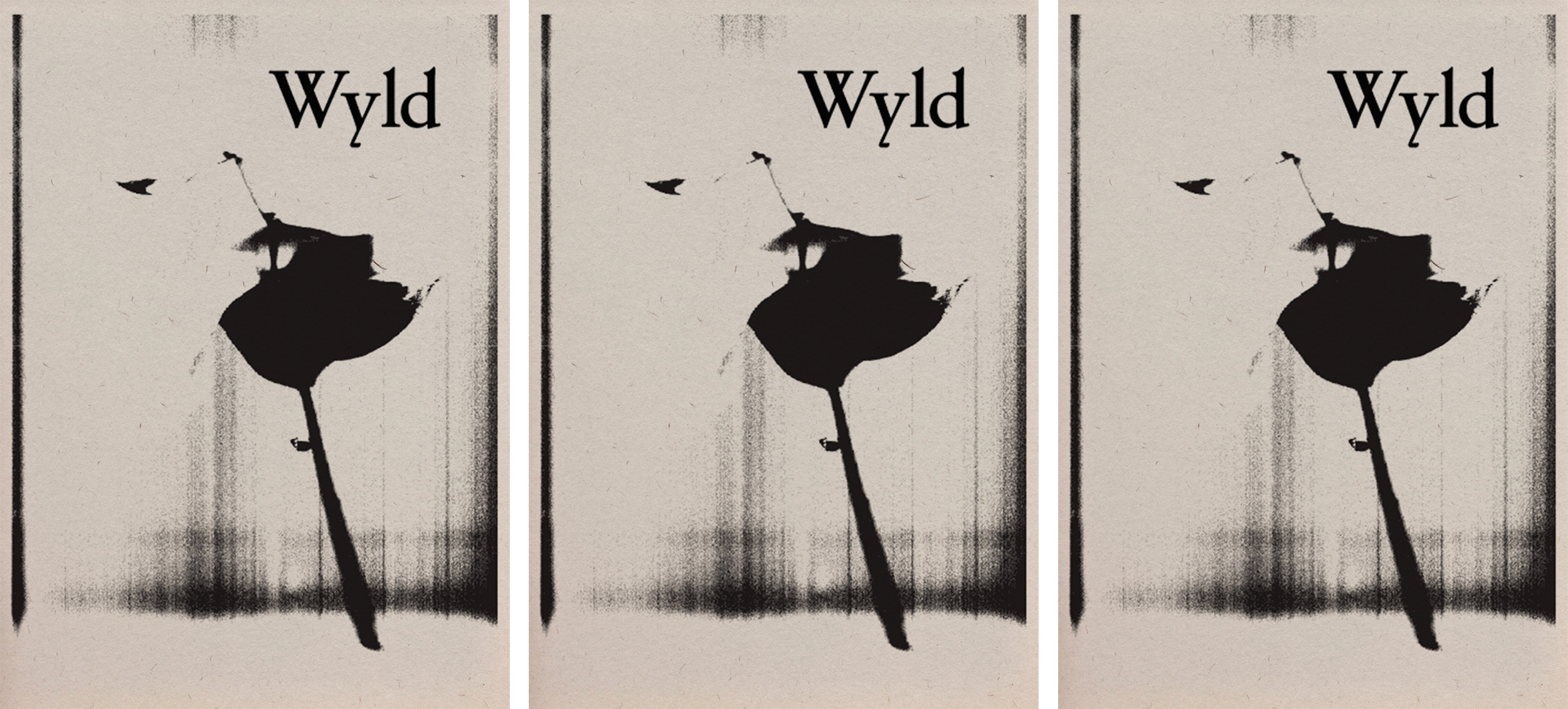
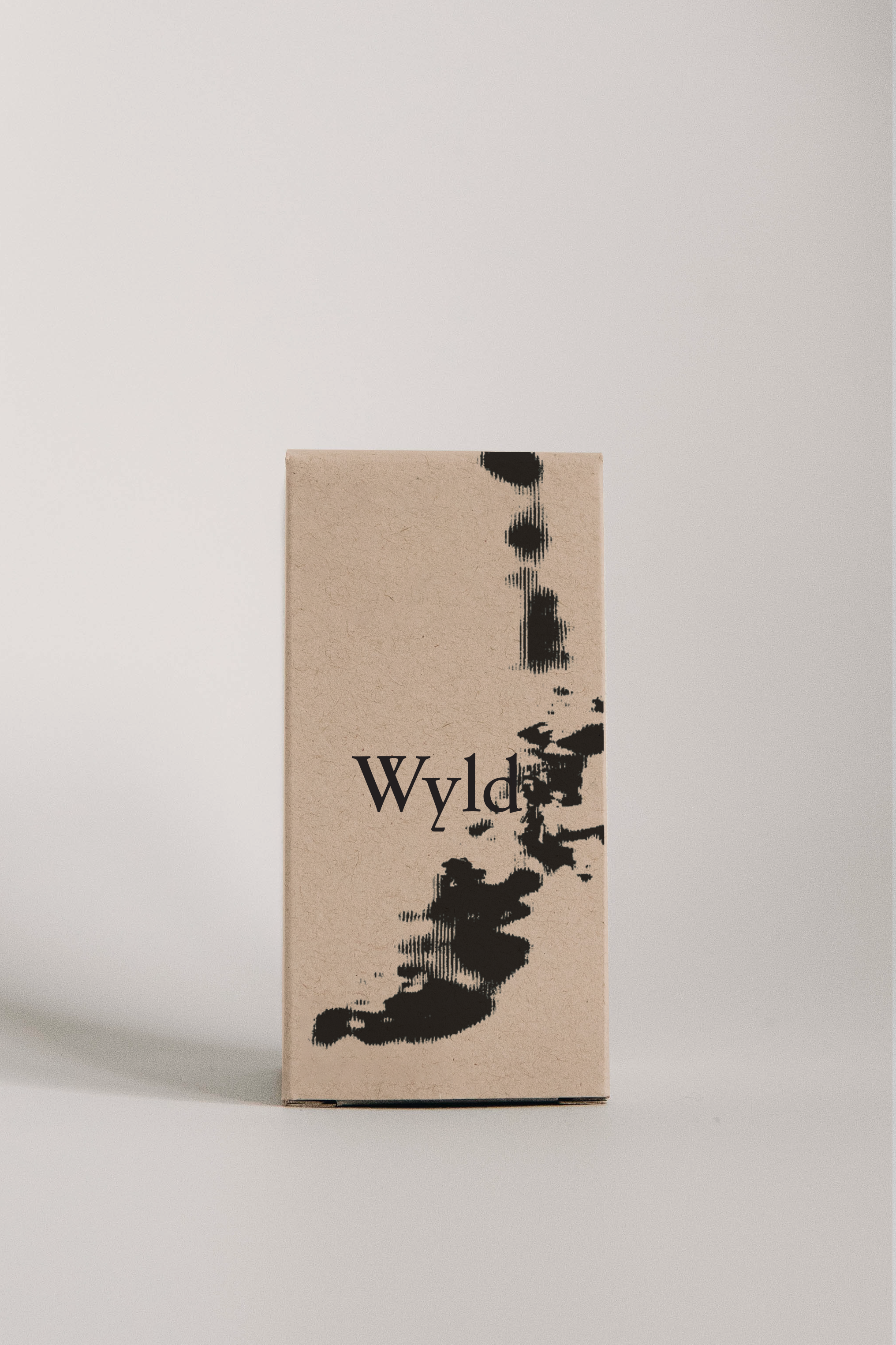
I worked with Bethany to develop the initial brand identity and packaging system. The logotype is based on a hand carved 16th-century alphabet. I gathered plants and scanned them to achieve unexpected reflections. Together, the type and visuals evoke the experimental, regenerative, and ‘wild’ aspects of nature.
Role —
Creative Direction & Design
Photo Credits —
Bethany Aponte
Mathilde Langevin

Mood board for Wyld brand identity. To build intrigue and stand apart from other organic product lines, we used strong contrasts with scale and color. An antique serif typeface made a historical connection with apothecaries.